Arc Forumnew | comments | leaders | submitlogin
Arc Logo (ycombinator.com)
15 points by pg 5442 days ago | 40 comments


7 points by conanite 5441 days ago | link

It's easily recognisable even when small which is important for a logo and a favicon. I like the colours. And clearly it shows an amazing degree of artistic talent, the sort that could only be acquired in art school :)

Allow me nonetheless second some other commenters who observed

- the #\a concept is not obvious

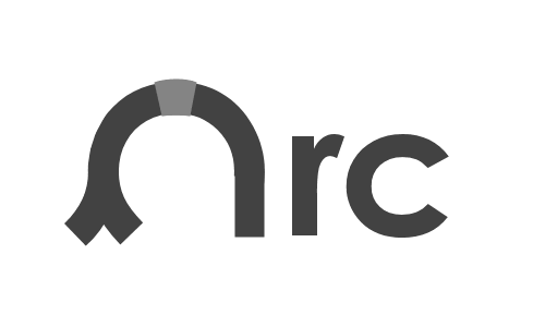
- the keystone would normally be part of the arch, not under it

- the blue and black are difficult to distinguish in the small version

- while you explain the #\a and the keystone, the red/blue business is mysterious, and perhaps a tad decadent - art for art's sake and all that.

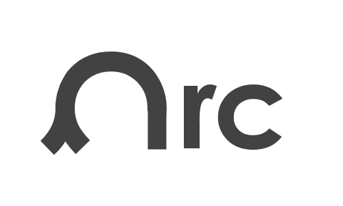
At a glance, it looks like the white bit has risen up out of the red bit (if you'll forgive the technical language here), and the blue bit is just background.

A slight improvement might be to make the horizontal edges of the #\a (top and bottom) a little thicker, to enhance the a-ity (although I can see that that might diminish the arch-ness). Another might be to use a brighter blue.

Are you planning to stick with this or are you inviting suggestions (not that the absence of an invitation has stopped me or anyone else) ?

-----

6 points by pg 5442 days ago | link

The red and blue bits together make a lowercase a. The white rectangle is supposed to represent a keystone.

-----

3 points by pmarin 5441 days ago | link

I see the lowercase a. The blue and black colors are too similar in my screen, I had to use the ancient xmag program to zoom the logo ;)

Anyway, I like the logo.

http://i39.tinypic.com/os8g8x.png

-----

3 points by pg 5441 days ago | link

You could have just clicked on the link: http://ycombinator.com/arc/arclogo.html

-----

5 points by olifante 5441 days ago | link

terrible logo, way too clever. Even after reading your explanation I didn't immediately get it. At the very least try a different colorscheme.

-----

5 points by gvb 5441 days ago | link

Ditto on not "getting" it. :-(

My first thought was "5 1/4 floppy icon."

-----

2 points by tc-rucho 5441 days ago | link

Lol, that's what it looked like to me at first sight too.

-----

1 point by w8lvn 5441 days ago | link

I do see the keystone, but the lowercase a is escaping me. It does stand out nicely as a favicon, however.

-----

1 point by bitdiddle 5441 days ago | link

ok, I see it now. Too square, perhaps if you rounded the a a little it would be more obvious.

-----

1 point by carmapple 5441 days ago | link

Supposed to is about as far as it goes.

Don't you have a friend who does design work? This isn't any good, not even as a starting place.

-----

6 points by pg 5441 days ago | link

Would you like it better if I told you I went to art school?

-----

1 point by verec 5414 days ago | link

And how many classes did you skip? :-)

-----

1 point by mitchellh 5441 days ago | link

I'm sorry... I just don't see it. =[

-----

7 points by miked 5441 days ago | link

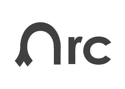
Since the name "Arc" is derived (according to a PG essay) from "arch", and since both start with the letter "A", why not modify an "A" to make it look a bit more like an arch? Simple and evocative.

-----

4 points by pygy 5441 days ago | link

Here's an implementation of that idea.

http://www.headrun.ulg.ac.be/arclogo.png

http://www.headrun.ulg.ac.be/arclogo2.png

http://www.headrun.ulg.ac.be/arclogo3.png

http://www.headrun.ulg.ac.be/arclogo4.png

Feel free to build on the idea.

The intent is: a Roman arch resting on a Lambda, making a lowercase a.

The new official logo would be better if the blue was lighter in the small version.

-----

1 point by bitdiddle 5441 days ago | link

sorry but the roundedness makes it look like a wilted flower

-----

1 point by pygy 5441 days ago | link

Is v4 better for you?

-----

2 points by jcsalterego 5441 days ago | link

Sorry for the repost: http://drop.io/arclogo/asset/arc-1-png

-----

2 points by bach 5441 days ago | link

Here's my 60 seconds in photoshop...

a lambda symbol under an church-style arch... lambda calculus, arc(h) & a nod to Alonzo Church

http://tinypic.com/view.php?pic=14n2y6h&s=5

worth another few minutes to refine further...?

-----

1 point by lojic 5441 days ago | link

My wife (a fine artist) liked the aesthetics and said it reminded her of a Mondrian painting, but she didn't get the lowercase 'a' or keystone :)

After your explanation, I do see the lowercase 'a'. But, it does bother me a little that the 'keystone' is rectangular vs. a wedge, as it seems like it might slip out of the arch.

I also see orthogonality and (as another poster said) a floppy disk.

Probably the most prominent image is a square which unfortunately doesn't seem very arc or arch like to me.

There seems to be a lot of potential with arcs, arches, 'A', lambda character, etc. Also, having a logo change is not a huge problem, so not getting paralyzed with an attempt to get the perfect logo initially is important IMO.

-----

4 points by curi 5441 days ago | link

it's hard to see the difference between the black and the blue in the top left when it's small.

i would never have guessed what it was.

i don't hate it though. just looks like some colors. seems reasonably recognizable. shrug.

-----

3 points by pg 5441 days ago | link

A logo doesn't have to look the same at every size, just fairly good at every size. Nor do the references have to be obvious; e.g. the arrow in the Fedex logo.

-----

3 points by thaddeus 5441 days ago | link

I like the orangy yellow banner color. The blue was kinda puky. This is much nicer. T.

-----

1 point by conanite 5441 days ago | link

you can configure a different banner colour on your user-settings page

-----

2 points by pg 5441 days ago | link

If anyone misses the old color, it was 99aadd.

-----

1 point by rntz 5441 days ago | link

This works for most pages, but even after changing back to the old color the color of the banner on the reply page is still orange.

-----

1 point by aston 5441 days ago | link

Here's the favicon I designed way back when this forum had an empty box in the corner. I still like it...

http://dl.getdropbox.com/u/165/arcfavicon.gif

-----

1 point by PebblesRox 5440 days ago | link

I think you should put parentheses around it :)

-----

1 point by grinich 5441 days ago | link

Recognizable, simple, unique, and scalable. Sure, it works as a logo.

I didn't see the arch and letter motif until it was explained. I think this was the case for most people. It's much less than subtle.

In my mind, an arc/arch is all about the curve; it's the fundamental and universal shape of timeless strength. (I'm guessing that's where the name originated.) Because of that, I'm having a really hard time connecting a square, blocky image to that idea. Orthogonality != Arch.

Icons need contrast and primary colors are a fair choice. But I'd tweak them a bit. At first glance, I was reminded of the default MS Paint palette or an maybe 8-bit Sol Lewitt. I think I'll help with the blue/black scaling issue too.

Arc isn't finished, and I'd guess neither is its logo. LISP (and its dialects) historically have had very atypical logos, so it's refreshing to see something new and thought-out.

-----

1 point by CatDancer 5440 days ago | link

The logo reminds me of children's blocks, and I imagine I can reach out, rearrange them, and build something different.

An appealing contrast to a building arch, which I imagine if I start rearranging the bricks, the building will fall down on me!

-----

1 point by tokipin 5440 days ago | link

may as well submit mine:

http://drop.io/tokipin/media

they're mostly screwaroundish and not particularly prone to small sizes

-----

3 points by bitdiddle 5441 days ago | link

To me the colors are too strong and it appears like some sort of key hole

-----

2 points by poub 5441 days ago | link

I don’t see the lowercase. I don’t see the arch either. I just see rectangles and squares with different colours.

I don’t think what I should see matters at all.

What’s important to me is that favicon is recognisable immediately on my URL bar, my RSS reader or history.

It can be printed on the Moon and I will still recognise it.

For that purpose the logo is efficient and that’s enough to me.

-----

1 point by jcsalterego 5441 days ago | link

Assuming it isn't blasphemous to offer suggestions, to get the ball rolling: http://drop.io/arclogo/asset/arc-1-png

The drop is open for uploads.

[Cross posted at hackerne.ws as well]

-----

2 points by conanite 5441 days ago | link

it's asking for "Guest or Admin password" - I tried "guest" but that didn't work ...

and here's a suggestion (and a shameless plug for iconfu)

http://iconfu.com/tags/list/0.html?browse=arc-logo

(implementation of miked's earlier idea)

-----

1 point by jcsalterego 5441 days ago | link

Thanks for pointing that out, I've failed us all. (Link works now)

-----

2 points by listic 5441 days ago | link

I think it's better to go with something like this:

http://www.bitbakery.com/arcstuff

or something simpler, like a single arc of the legato sign.

-----

2 points by ziadbc 5441 days ago | link

Looks kind of like the castle at the end of a level in Super Mario Brothers.

-----

1 point by dc2k08 5440 days ago | link

Here's my three so far:

http://img4.imageshack.us/img4/7305/arcdph.jpg

http://img4.imageshack.us/img4/5518/arcbluew.jpg

http://img36.imageshack.us/img36/762/arcship.jpg

-----

1 point by hm2k 5441 days ago | link

The 1970s called, they want their logo back! :)

-----