Arc Forum
new
|
comments
|
leaders
|
submit
login
5 points
by
chris_l
6315 days ago |
link
|
parent
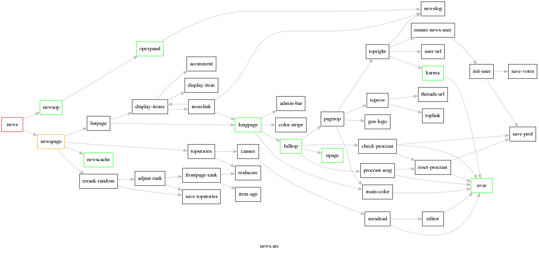
For a more readable version, here I have only plotted what comes below a single newsop (news):
http://electronreactor.files.wordpress.com/2009/02/news2.png
2 points
by
jonnytran
6313 days ago |
link
Thank you for making this reduced graph. I'm all for visualization, but the full call graph seemed to show nothing except how useless a full call graph is.
-----
1 point
by
chris_l
6313 days ago |
link
Yeah, that dawned on me after posting it... :)
-----
